Penfolds: Navigation and Checkout Redesign
A heritage wine brand with a global catalogue, a navigation menu that had grown to hold all of it, and a checkout that asked people to create an account before they could buy.
A Swinburne University capstone, run with the Penfolds team at Treasury Wine Estates.
Role
UX Research & Design (solo)
Timeline
12–13 weeks, 2024
Context
Swinburne capstone with Penfolds / Treasury Wine Estates
CONTEXT
This was my capstone project as a UX design student at Swinburne University, run with Penfolds, part of Treasury Wine Estates, where I had previously worked. It ran for about 12 to 13 weeks.
It was not a paid engagement, and I want to be straight about that. What it was: a real brief, on a real commercial site, with the Penfolds team sharing their Google Analytics data and sitting through the presentation at the end. The constraints were real even if the contract wasn't.
The scope was three connected surfaces: the global navigation, the mini-cart, and the checkout.
THE PROBLEM
Penfolds sells a large, deep catalogue: wines by range, by region, by variety, by vintage, plus cellar doors, restaurants, events, clubs and a century of brand history. All of it had found its way into the global navigation.
The result was a menu where categories expanded into more categories, which expanded again. Every item that went in made the menu more complete and every item made it harder to use.
Four problems compounded: cognitive overload from too many simultaneous options; a cluttered presentation working against a brand built on restraint; a structure that fought the mobile devices most people were arriving on; and reduced discoverability, where important pages were harder to find precisely because so much surrounded them.
The mini-cart and checkout had the second half of the problem. A multi-step checkout, limited payment options, no visible signals that the transaction was secure, and mandatory account creation before purchase. Each one is a reason to leave a cart behind.
RESEARCH
I ran interviews and surveys with people from a range of backgrounds, looking at how they browse and buy online generally, not only on Penfolds. Alongside that: competitive analysis, published case studies, and the Google Analytics data Penfolds provided for their own site.
What came back consistently
- Most people were shopping on mobile devices.
- Bloated, confusing navigation was actively disliked, and named unprompted.
- Search matters disproportionately on mobile, and people expect to find it immediately.
- Payment choice matters. Afterpay, PayPal, Apple Pay, Google Pay, or simply knowing their card is accepted.
- Poor mobile responsiveness was enough on its own to end a session.
The analytics gave me the other half: which parts of the site people actually used. That turned navigation from a matter of taste into a matter of evidence.
TARGET USERS
Two personas came out of the interviews, and I designed against their goals rather than their demographics.
Sarah
Mobile-first shopper
Browses and buys almost entirely on her phone. Values sites that clearly work on mobile rather than tolerate it.
- Complete a purchase on a phone without friction
- See the real cost early, with no surprise tax or shipping at the last step
James
Confident across devices
Comfortable with technology, moves between laptop and phone mid-purchase. Cares about who he is buying from.
- Buy quickly and know the transaction is secure
- Confirm the retailer is local, with a returns policy he can find
NAVIGATION
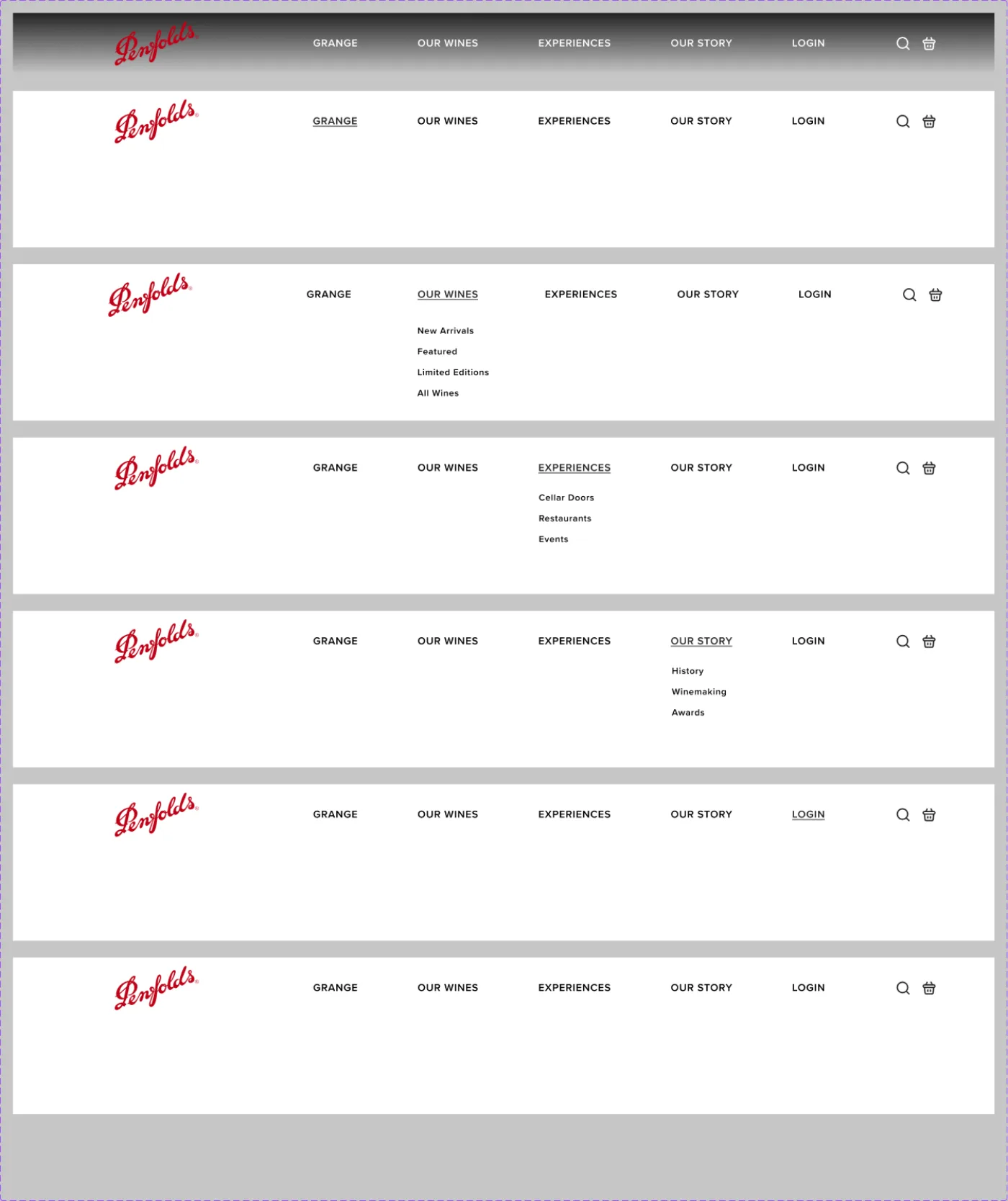
I re-mapped and re-prioritised the menu against the analytics rather than against the org chart. Five top-level items survived: Grange, Our Wines, Experiences, Our Story, and Login.
The decisions
- Grange sits first. It is the wine the brand is known for and the data agreed.
- Our Wines collapsed to four entries: New Arrivals, Featured, Limited Editions, All Wines. The granular cuts people actually browse by, like variety and region, moved out of the menu.
- Granular categories became pre-filtered views, linked from the footer. This is the part I am happiest with. Region and variety pages did not get deleted. They became filtered states of the wine listing, reached from the footer. The menu got shorter without the site losing a single route.
- Experiences stayed prominent: Cellar Doors, Restaurants, Events. Usage justified it, not because it felt important.
- Our Story kept History, Winemaking and Awards at top level; sustainability, philosophy and the story of Grange moved to the footer.
The footer stopped being a dumping ground and became the second half of the information architecture: the place for depth, once the menu was handling breadth.
THE MINI-CART
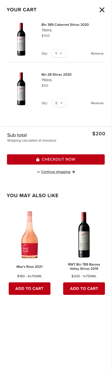
The existing cart used an X to close the panel and an X to remove an item. Two identical controls, inches apart, with very different consequences. One dismisses the cart, the other deletes something you chose to buy.
I replaced the destructive one with the word Remove. The X now means only one thing. It is a small change and it is the one I would defend hardest: the cost of getting it wrong is a customer losing a selection they had already committed to.
The rest of the panel
- Subtotal shown immediately, with shipping explicitly noted as calculated at checkout, so there is no surprise at the final step.
- A quantity dropdown that starts at one and cannot reach zero. Removing an item is a deliberate act, not an accident of decrementing.
- Visual hierarchy following how the eye moves: image, then name, then format and price, then quantity, with Remove last: present, but never the first thing found.
- A prominent checkout button carrying a padlock, and a quieter continue-shopping route for people not finished yet.
- Suggested products kept, below the decision rather than above it.
CHECKOUT
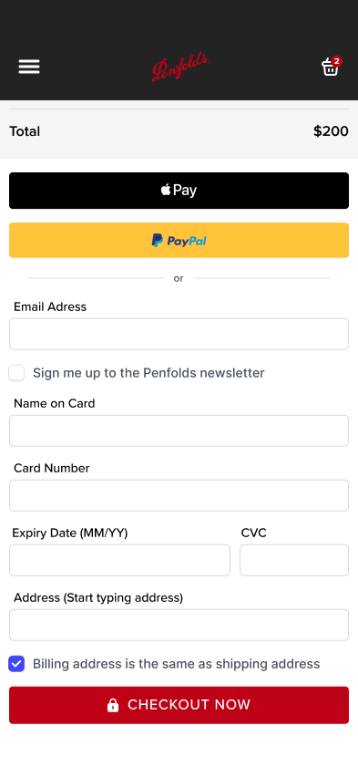
The significant product decision was removing the requirement to create an account before buying.
The business case for forced registration is real: an account captures an email address, supports marketing, and builds a customer profile. It is not an irrational thing to want. But published research on checkout abandonment puts the cost of compelling it at roughly a quarter of would-be purchasers, and a customer who leaves gives you neither the sale nor the email address.
So the account became optional, and the newsletter became a checkbox inside the flow. The business still gets the address from people happy to give it, and stops trading sales for the ones who are not.
Supporting decisions
- Express payment via Apple Pay and PayPal, with room for others. Familiar payment branding does double duty as a trust signal.
- Fewer fields: address autocomplete instead of a column of inputs, and billing defaulting to the shipping address.
- A padlock at the point of payment. Most people never look at the browser address bar for the SSL indicator, so the reassurance has to live where the decision is made.
- A two-column split, inputs on the left and order summary on the right, so what you are buying stays visible while you enter details.
- Free-shipping threshold surfaced in the summary, and a confirmation page with order number, shipping and payment details.
MOBILE
Mobile was not a narrower version of the desktop design. Two decisions diverged deliberately.
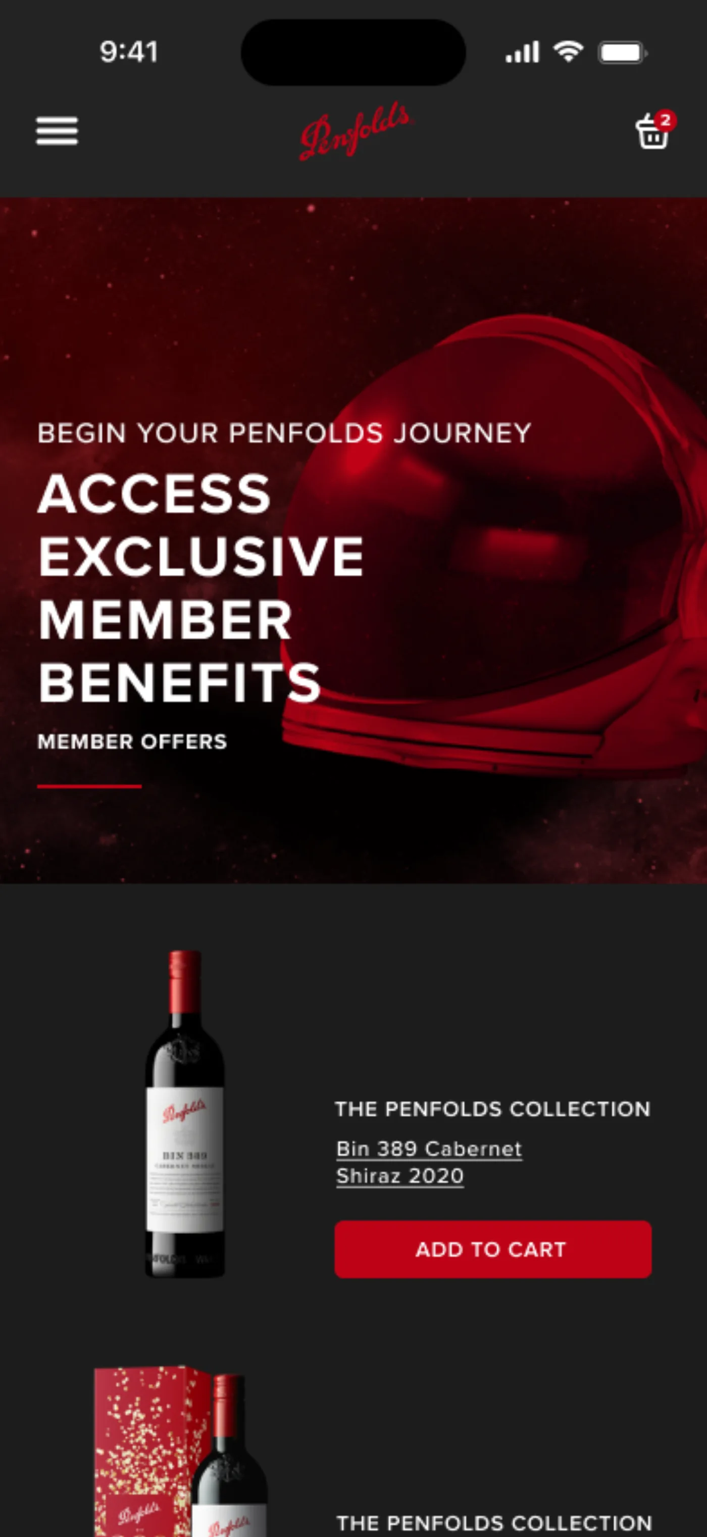
Search moved to the top of the menu. Interviews were unambiguous that search carries more weight on a phone, so opening the hamburger puts search first, expanding into a dedicated field and button rather than sending people to a separate page.
The mini-cart overlay disappeared entirely. On a small screen, an overlay summarising a cart before a separate checkout is a step that costs more than it gives. Tapping the cart goes straight to checkout, with the order summary collapsed behind a show-full-summary control for anyone who wants to verify it. Same information, one less stop.
The footer restructured from five columns to two, and the nav headings took extra weight to separate parent from child in a stacked list.

ACCESSIBILITY
Accessibility was set as a project goal rather than a final pass: colour contrast, touch targets sized for real thumbs, correct labelling, and an information order that still makes sense read aloud by a screen reader.
Consistency between desktop and mobile did related work: the same elements in the same relative places, so moving between devices mid-purchase does not mean relearning the interface.
Honestly: this was specified and designed for, not audited. I did not run it against assistive technology, and I would not claim it as verified.
WHAT HAPPENED
I built interactive prototypes for desktop and mobile in Figma, matching the existing Penfolds design language, and presented the work back to their team with the prototypes shared for them to use.
Then it stopped. The designs were never implemented.
Validation testing was the next step and the project ended before it ran, so I have no usability findings and no conversion numbers. I would rather say that plainly than dress up a prediction as a result.
As for why none of it shipped: it was not a verdict on the work. Changes to a site like this move through commercial, brand, legal, technical and regional approval gates, and a redesign of the global navigation touches every one of them. The work was sound and it had no route through the organisation.
That is the part I actually took with me. I spent eight years in change management before this, and I had watched good proposals die in approval chains from the other side of the table. Penfolds was the first time it happened to something I had designed myself. A design that cannot be adopted is not finished, and adoption is a design problem. It needs a route mapped through the organisation, and stakeholders brought along early enough to have a stake in it.
If I ran this again, I would spend less time perfecting the prototype and more time on the smallest shippable slice, the mini-cart X, say, and on who would need to say yes to it.
FEEDBACK
“This is a much cleaner and user-friendly experience through these key areas of the site. The navigation, mini cart, and checkout improvements are fantastic, especially for mobile users. Honestly brilliant work.”